Trading with only candlestick charts can sometimes feel like flying blind. That’s where Footprint Charts come in. They provide highly valuable insights into market behaviour, like an X-ray view of what’s happening inside each candle. They reveal trader intent and help you spot key market opportunities.
The rise in popularity of footprint charts is well deserved. Staying informed is crucial for traders, and these charts deliver vital information by focusing on volume data. Thanks to growing interest, platforms like TradingView now offer footprint charts alongside other advanced platforms, such as ATAS, Quantower, and ExoCharts.
What Are Footprint Charts?
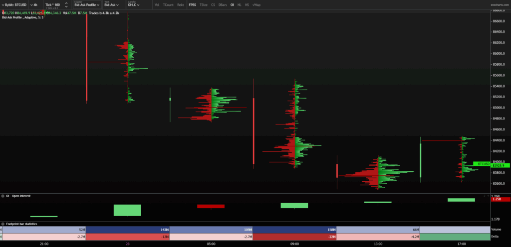
A footprint chart provides a detailed view of the volume within each candlestick. We can combine price and volume with this data, which is an incredible edge. You can see how much volume was traded at each price level. This term is also used very in the order flow technique.
Think of it as having an X-ray machine for the markets. You can peek inside each candle and see how many buyers and sellers were active at different price points.
At Chart Champions, we use footprint charts to:
- Identify support and resistance across different timeframes.
- Confirm acceptance or rejection above/below key levels.
The data in footprint charts comes from market orders, which move the market. Limit orders alone wouldn’t cause price movement, so market orders reveal trader intent, making volume a crucial analytical tool.
Footprint Charts vs. Candlestick Charts
Knowledge is power. Understanding the difference between footprint and standard candlestick charts can help you select the most suitable tool for your trading style.
- Candlesticks show Open, High, Low, and Close (OHLC) prices.
- Footprint Charts show how many contracts were bought or sold at each price level.
Even with a standard volume indicator in TradingView, you only get the total volume per session, not by individual price level. Footprint charts solve that limitation.
When activated, you’ll see a box filled with numbers. These represent the number of contracts executed at each price level, i.e., volume.
How to Read Footprint Charts
You’ll mainly work with Volume, Bid x Ask, and Delta data. Here’s a breakdown:
Volume
Shows the total number of transactions at each price level. Buys and sells combined.
The Point of Control (POC) is the highest volume level, a crucial area where price often reacts.
Bid x Ask
Bid and Ask split the volume into buyers and sellers. You’ll see the sell volume on the left and the buy volume on the right, which provides clearer insight into market pressure.
Delta
The formula:
Delta = Market Buys – Market Sells
A positive Delta means buying pressure; a negative Delta shows selling dominance. It reveals who’s in control.
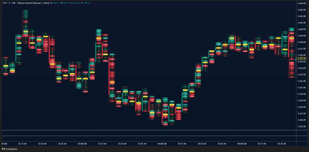
Types of Footprint Charts
Bid and Ask profile is great for day traders. It highlights live buying and selling near key levels. It is easy to spot volume nodes thanks to the volume distribution within each candle.
Volume Clusters are ideal for swing and day traders. Darker colours indicate high volume, while lighter colours indicate low volume.
Footprint Trading Strategies
Learning to interpret footprint charts is just as important as understanding their components. Here are some of the most common strategies we teach at Chart Champions:
Breakout Trade Recipe (Order Flow)
When the price breaks down, we want the following:
- Rising volume
- Lower POC on each candle
- Increasing sell volume and negative delta.
A strong breakout candle with the POC at the bottom and dominant sell-side pressure signals sellers stepping in with conviction, favouring short entries.
On the other hand, when the price breaks up, we want to see:
- Rising volume
- Higher POC on each candle
- Increasing buy volume and positive delta.
Support and Resistance based on Volume
High-volume nodes serve as significant support/resistance zones. Prices often react when revisiting these zones, making them valuable. In footprint charts, these zones appear as dark-shaded areas within the volume cluster, highlighting where the most volume has been transacted.

Once we spot this zone (yellow narrows in the picture above), we look for confluences around it to strengthen the setup. We don’t rely on this technique alone; incorporating confluences is crucial to increasing the probability of success.
Buying or Selling Imbalances (Absorption)
In a cluster or a profile, an imbalance is identified by being highlighted in black. In the following example, we’ll see buy orders in green and sell orders in red.
- Imbalances appear diagonally on the chart.
- Buy Imbalances shown on the right; Sell Imbalances on the left.
If the price doesn’t move in the expected direction (e.g., a heavy buy imbalance but no upward movement), it indicates that absorption is occurring. The market may reverse hard in the opposite direction.
Examples:
- Bullish absorption at lows: Selling pressure isn’t pushing the price lower.
- Bearish absorption at highs: Buying pressure isn’t lifting the price further.
Breakout Imbalances
- Downside breakout → Look for high-volume sell imbalances.
- Upside breakout → Look for high-volume buy imbalances.

Best Software for Footprint Analysis
The top platforms are Quantower, ExoCharts, ATAS, Sierra Charts, and NinjaTrader. Fortunately, TradingView offers footprint charts to Premium users.
ATAS gives crypto traders free order flow tools. Exocharts (web version) shows footprints in 4h+ timeframes, which is great for beginners.
Conclusion
The real strength of footprint charts is revealing what happens inside each candle, highlighting where buyers and sellers are positioned.
However, don’t rely on footprint data in isolation. Context is king. Before executing a trade, consider market conditions, confluences, trends, and nearby support/resistance areas.
If you’re going long, make sure the local trend is bullish. If you’re going short, confirm that the local trend is bearish.